vcfR documentation
byBrian J. Knaus and Niklaus J. Grünwald
Depth plot
Once a sequencing run is complete the data are typically mapped to a reference genome, variants are called and these variant are stored in a VCF file. At this point one of the first questions asked is how well did the sequencing go? One measure of sequencing quality is sequence depth or how many times each position was sequenced. In VCF data only information on the variable positions are reported. But this can be used as a convenient subset of an entire genome. Many variant callers report this information, but not all. Make sure to check your variant caller documentation if you do not see this information in your file, there is a chance it was an option that was not selected. Here we visualize the depth information from a VCF file to provide a perspective on sequence quality.
We can extract the depth data (DP) as explained elsewhere. This results in a matrix of depth data. We can take a quick peak at this to remind us what it looks like.
library(vcfR)
vcf <- read.vcfR('TASSEL_GBS0077.vcf.gz')
dp <- extract.gt(vcf, element = "DP", as.numeric=TRUE)dp[1:4,1:6]## 1 10 13 1725-d-8-21-07-r-1-pm-r 18 1858-d-10-15-07-p-3-pm-r
## S1_4509 5 10 9 NA 5 NA
## S1_4657 1 4 1 NA 7 NA
## S1_5193 NA NA 3 NA NA NA
## S1_5647 5 8 NA NA 3 NAWe see that it is a large matrix containing lots of numbers, so viewing it directly is of little use. Here we’ll demonstrate the use of barplots and violin plots to visualize this data.
Base barplot
Base R includes a great selection of graphical tools. One is
barplot(). A few things nice about this function is that it
is designed to work on matrices, such as the one we have, and that it is
quick to execute.
par(mar=c(12,4,4,2))
boxplot(dp, col=2:8, las=3)
title(ylab = "Depth (DP)")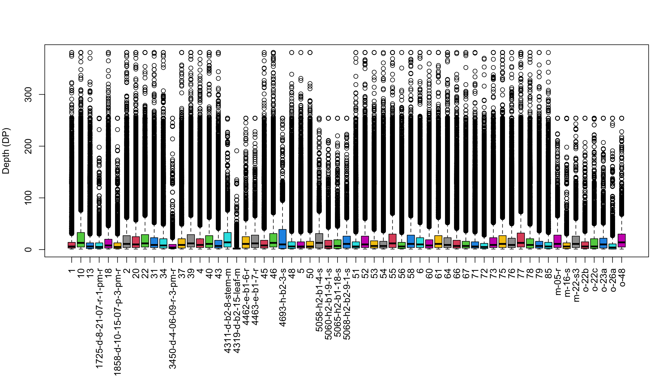
par(mar=c(5,4,4,2))We’ve generated a box and whisker plot for each sample where 50% of the data is contained within each colored box and outliers are presented as circles. One issue with this plot is that all of the data seem squished at the bottom of the plot. A log transformation could help this plot. Remember that log of zero is undefined, so if you persue a log transformation you may need to handle these cases. An observation to note is that the samples appear to exist as two classes. The samples with long names appear to have lower sequence depth. This is likely due to some form of batch effect.
Violin plot
Violin plots are similar to boxplots except that they attempt to present the distribution of the data that would otherwise be represented by a box. We’ll neeed to load a few packages to add functions to help us. I think you’ll see that violin plots are a little more involved to create, and they are slower to render, but many find them to be more informative and more aesthetically pleasing.
#library(reshape2)
library(ggplot2)
library(cowplot)

# Melt our matrix into a long form data.frame.
# https://stackoverflow.com/a/48392823
names(dimnames(dp)) <- c('Variant','Sample')
#dp[1:3, 1:5]
dpf <- as.data.frame(
  as.table(dp),
  responseName = 'Depth'
)

# Melt our matrix into a long form data.frame.
#dpf <- melt(dp, varnames=c('Index', 'Sample'), value.name = 'Depth', na.rm=TRUE)
dpf <- dpf[ dpf$Depth > 0,]

# Create a row designator.
# You may want to adjust this
#samps_per_row <- 20
samps_per_row <- 16
myRows <- ceiling(length(levels(dpf$Sample))/samps_per_row)
myList <- vector(mode = "list", length = myRows)

for(i in 1:myRows){
  myIndex <- c(i*samps_per_row - samps_per_row + 1):c(i*samps_per_row)
  myIndex <- myIndex[myIndex <= length(levels(dpf$Sample))]
  myLevels <- levels(dpf$Sample)[myIndex]
  myRegex <- paste(myLevels, collapse = "$|^")
  myRegex <- paste("^", myRegex, "$", sep = "")
  myList[[i]] <- dpf[grep(myRegex, dpf$Sample),]
  myList[[i]]$Sample <- factor(myList[[i]]$Sample)
}

# Create the plot.
myPlots <- vector(mode = "list", length = myRows)
for(i in 1:myRows){
  myPlots[[i]] <- ggplot(myList[[i]], aes(x=Sample, y=Depth)) +
                  geom_violin(fill="#8dd3c7", adjust=1.0, scale = "count", trim=TRUE)

  myPlots[[i]] <- myPlots[[i]] + theme_bw()
  myPlots[[i]] <- myPlots[[i]] + theme(axis.title.x = element_blank(),
                  axis.text.x = element_text(angle = 60, hjust = 1))
  myPlots[[i]] <- myPlots[[i]] + scale_y_continuous(trans=scales::log2_trans(),
                  breaks=c(1, 10, 100, 800),
                  minor_breaks=c(1:10, 2:10*10, 2:8*100))
  myPlots[[i]] <- myPlots[[i]] + theme( panel.grid.major.y=element_line(color = "#A9A9A9", size=0.6) )
  myPlots[[i]] <- myPlots[[i]] + theme( panel.grid.minor.y=element_line(color = "#C0C0C0", size=0.2) )
}
## Warning: The `size` argument of `element_line()` is deprecated as of ggplot2 3.4.0.
## ℹ Please use the `linewidth` argument instead.
## This warning is displayed once per session.
## Call `lifecycle::last_lifecycle_warnings()` to see where this warning was
## generated.# Plot the plot.
plot_grid(plotlist = myPlots, nrow = myRows)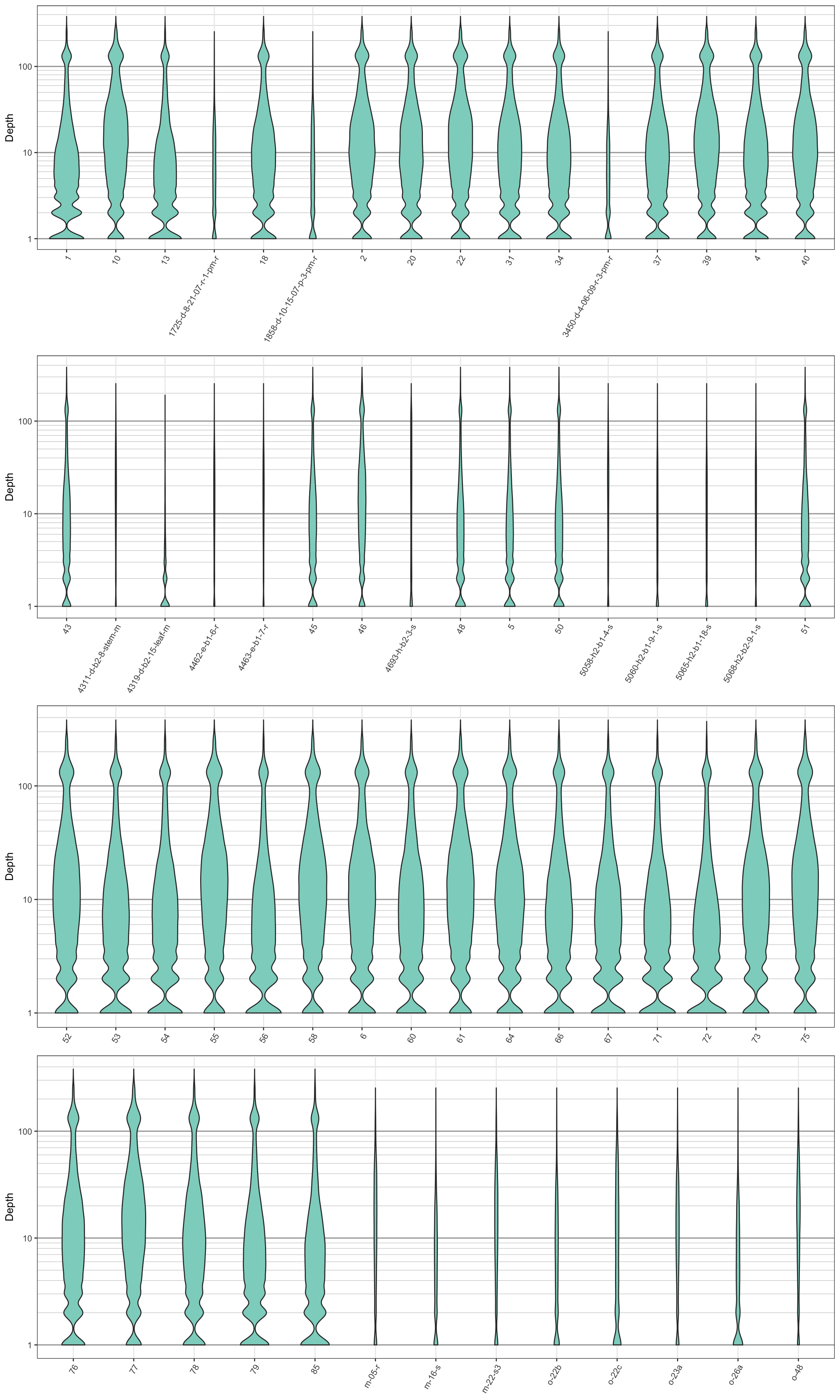
We can see that the log transformation stretches out the smaller values and compresses the larger values. This allows us to focus on where our data has the greatest density. We see that the samples with long names have more narrow plots than the samples with short names. This is because they have less data. This is another perspective on what we saw in the barplots. Things to look for in these plots are whether all samples are equally represented, whether there are a few samples of low quality that may need to be omitted from downstream analyses, or if therre are a small number of jackpot samples that received all the reads at the expense of the other samples. Here the samples appear to be eqaully represented with the exception of the issues noted with the samples with long names.
Copyright © 2017, 2018 Brian J. Knaus. All rights reserved.
USDA Agricultural Research Service, Horticultural Crops Research Lab.